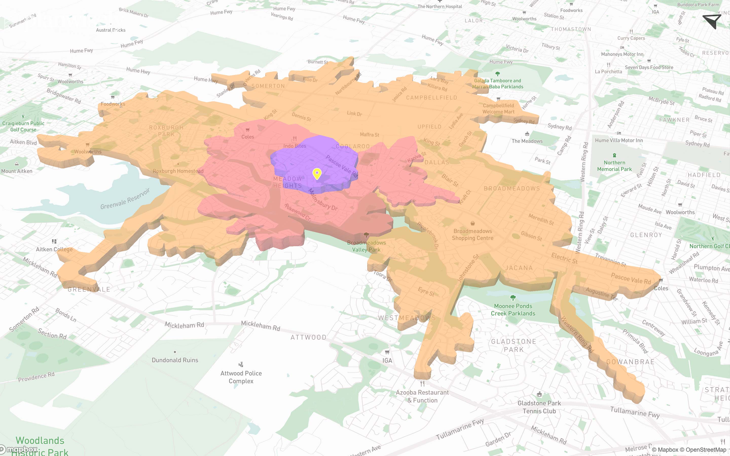
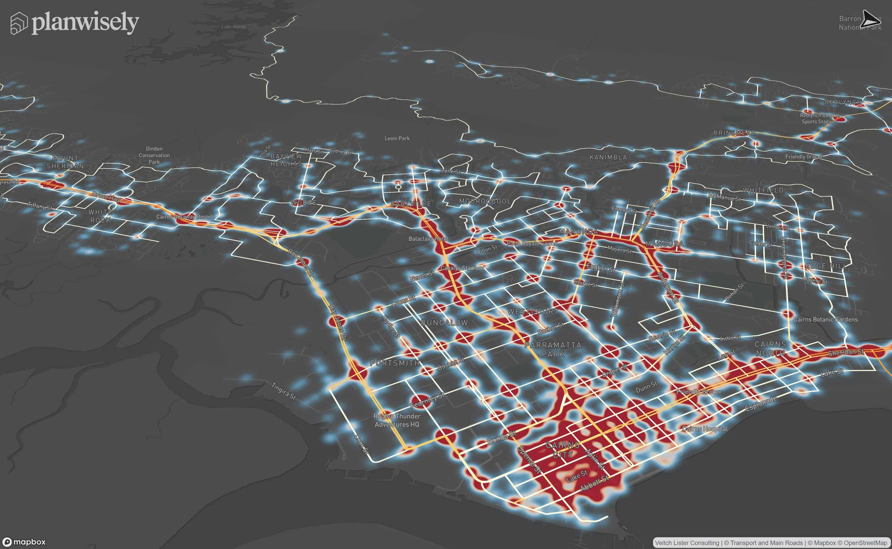
Styling your data gives you the ability to customise how it's displayed on the map to suit your analysis.
Available for a number of layers in your data library, binning allows you to adjust how a layer's data is grouped into units. Custom binning can help simplify and clarify your map visualisation.
Select Custom under Colouring to adjust individual bins or add and remove bins using the + and - buttons next to each bin. Select Reset Bins to revert them to their original colours and value ranges.
There are multiple colour schemes available to display data within Planwisely.
Select Style from the Layer toolbox, then select a colour scheme and palette.
Available colour schemes include:
- Sequential - Uses a gradient of colours to order data from low to high values.
- Single Hue - Uses a gradient of a single colour to order data from low to high values.
- Diverging Colour - Uses two contrasting colours that diverge from a neutral midpoint. Ideal for data with a meaningful central value.
- Qualitative - Uses distinct colours to represent different categories or types of data. Ideal for data that is categorised without a specific scale or order.
- Custom - Allows you to select your own colours according using hex codes, a colour picker
You can invert the colours in your chosen colour scheme by selecting the Reverse checkbox.
You can also adjust the opacity of the data layer using the Opacity slider.
You can also revert to the original colour scheme at any time by selecting Reset Styles from the Layer toolbox.
Most layers in your spatial data library give you the option to filter the data that appears on the map on a scale that's specific to that dataset.
Use the slider(s), if one is available, under Filters to adjust which data is visualised on the map.
Labels are specific to the data layer you currently have selected. They can be turned on or off using the Labels toggle to add additional context or clean up the map view.
You can also remove legends from the map using the Legend toggle. This can be useful when visualising multiple datasets at once.
Under Style, you can adjust the size of icons by selecting Custom and then a pixel size that suits.
You can also change the icons themselves by selecting a different one from the options presented under the Symbol Icon option.
Iconography categories include:
- Activities
- Buildings
- Transport
- Generic

Recommended Articles
Adding your own local data
You can visualise and analyse your own datasets quickly and securely in Planwisely.

The catchment analysis tool
Analyse accessibility and generate demographic reports using Planwisely's catchment analysis tool.

Map controls and navigation
Discover the essentials on how to get around the map in Planwisely.


