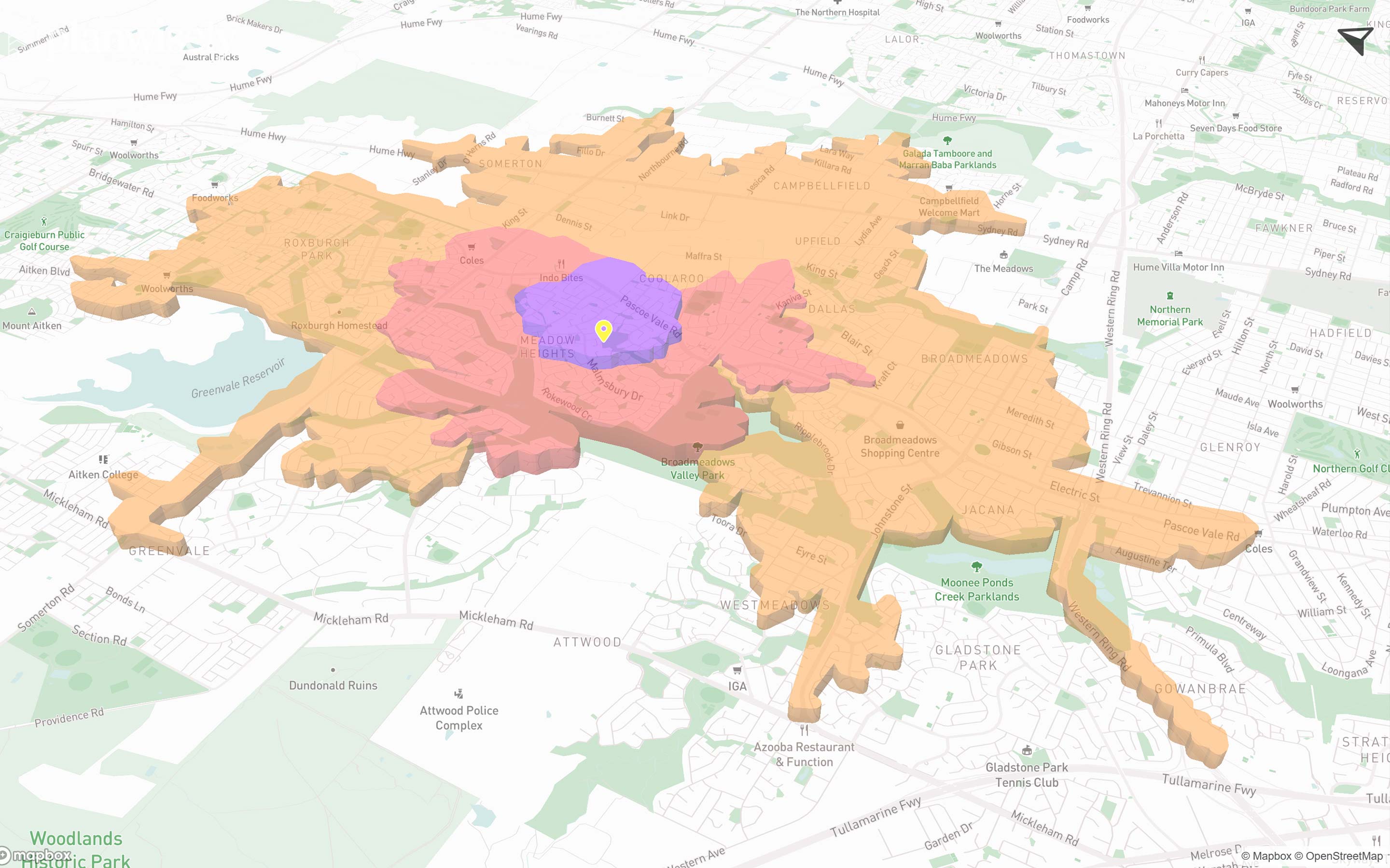
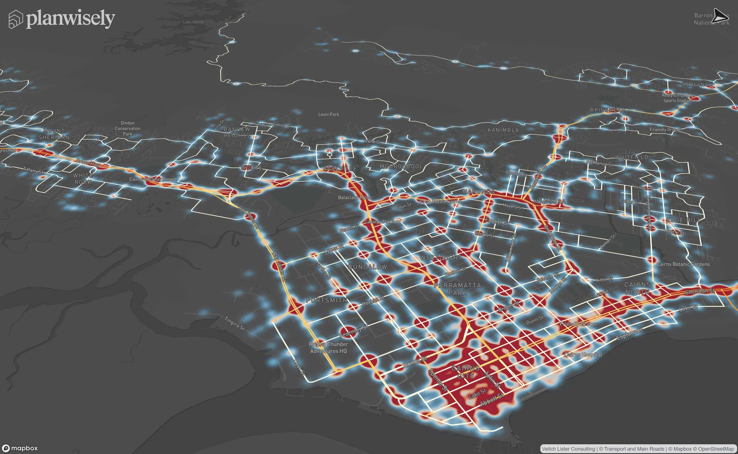
Heatmaps visualises People Movement Data to depict movement activity and dwells on the map. People Movement Data is an optional add-on to your Planwisely account.
After selecting Heatmaps, the map will populate with data. The heatmap visualises Movement activity by default, however you can change this to Dwells at any time.
heading
Lorem ipsum dolor sit amet, consectetur adipiscing elit.
{{intro_rich_text}}
{{content_rich_text}}
You can aggregate, isolate or compare time periods of People Movement Data to perform analysis on specific periods of time.
You can select/deselect individual years for your analysis by clicking on them.
Using the Hours and Days sliders, you can customise your analysis and further narrow your results.
The Style tab gives you the ability to adjust the following elements of how the heatmap is presented.

heading
Lorem ipsum dolor sit amet, consectetur adipiscing elit.
{{intro_rich_text}}
{{content_rich_text}}
Recommended Articles
Adding your own local data
You can visualise and analyse your own datasets quickly and securely in Planwisely.

The catchment analysis tool
Analyse accessibility and generate demographic reports using Planwisely's catchment analysis tool.

Map controls and navigation
Discover the essentials on how to get around the map in Planwisely.


